
Services
Digital Marketing
- Web Design
- Wordpress Design
- E-commerce Design
- UI/UX Design
- Responsive Design
- Website Redesign
Development Services
- Web Development
- Wordpress
- PHP
- Website Maintenance
- Website Migration
- Speed Optimization
Marketing Services
- Digital Marketing
- SEO
- PPC
- Content Marketing
- Social Media
- Amazon Marketing
Amazon Marketing
- Account Management
- PPC Management
- Amazon SEO
- Listing Optimization
- Account Audit
- Walmart Acc. Management
Industries
Hire Team
Developer
- Web Developer
- WordPress Developer
- PHP Developer
- Shopify Developer
Resources
Get Your Free Quote Now
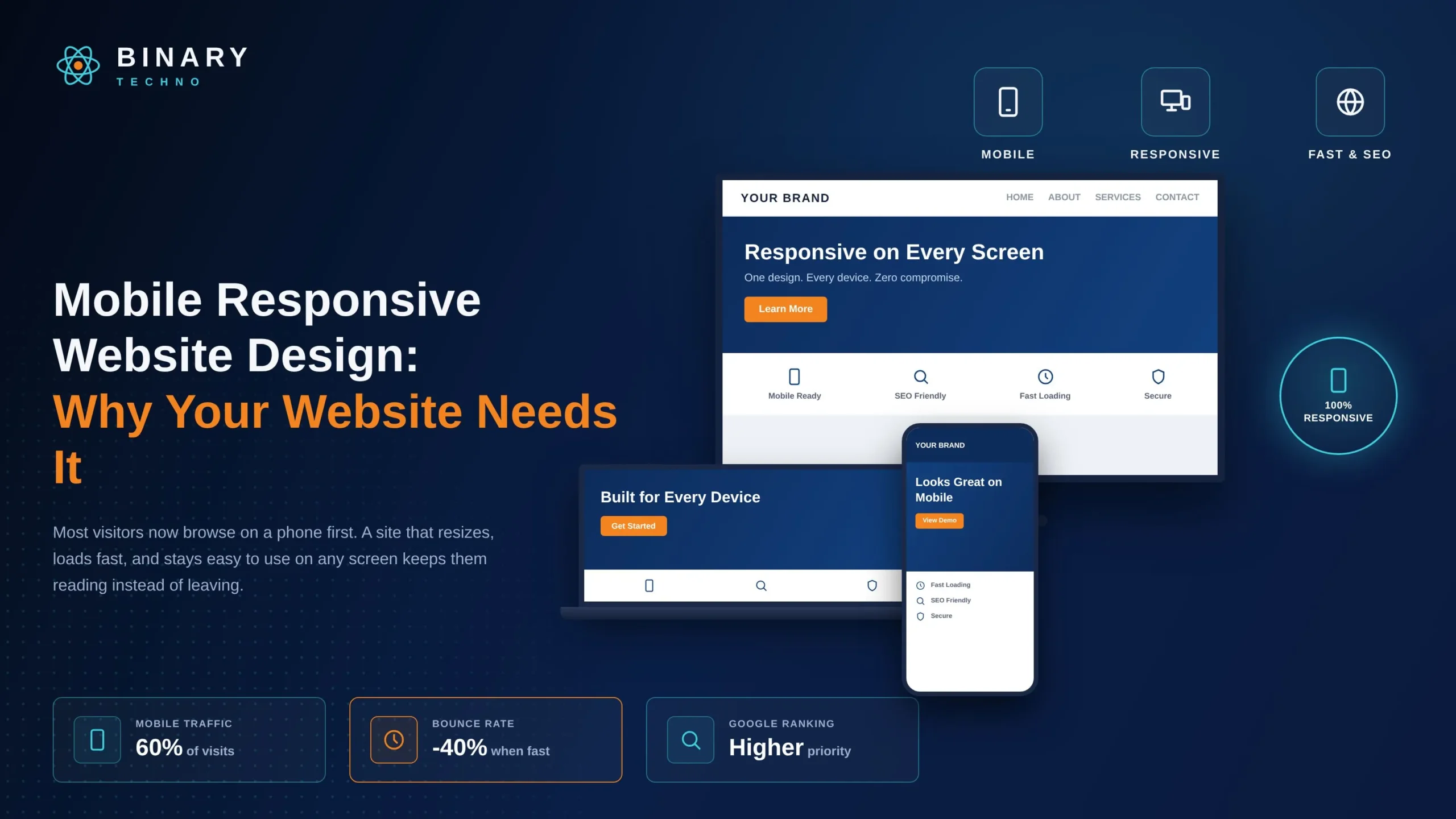
Mobile Responsive Website Design: Why Your Website Needs It
Objective
This blog explains why responsive design matters, how it works, its SEO benefits, key practices, testing methods, and costs for modern websites.
People now use their phones for almost everything online. They search for businesses, read content, shop, and make bookings. If your website does not work well on mobile, you may lose these visitors.
Mobile responsive website design makes your website fit different screen sizes. It adjusts the text, images, buttons, and menus to each device. This makes your website easier to use on phones, tablets, and computers.
A responsive website also gives visitors a better experience. It can help improve mobile SEO, engagement, and conversions. In this blog, we will explain why your website needs responsive design and how it can help your business.
Key Takeaways
- Mobile responsive website design automatically adjusts your site’s layout, text, images, and navigation to fit any screen size, from phones to desktops.
- Most web traffic now comes from mobile devices, so a non-responsive site risks losing visitors, leads, and sales.
- Responsive design directly impacts SEO by improving mobile usability, avoiding duplicate content issues, and supporting better Core Web Vitals scores.
- Responsive design differs from adaptive design — responsive uses one fluid layout, while adaptive relies on multiple fixed layouts for specific devices.
- Key features of a responsive site include fluid grids, flexible images, media queries, touch-friendly navigation, and fast loading speed.
- Costs vary based on complexity, custom design needs, and number of features, but the investment generally pays off through better engagement and conversions.
Did You Know?
StatCounter reported that mobile devices accounted for 52.23% of worldwide web usage in June 2026, compared with 47.77% for desktop. This supports the need for websites that work well across mobile screens.
Table of Contents
- What Is Mobile Responsive Website Design?
- Why Mobile Responsive Design Matters
- Key Features of a Responsive Website
- Mobile Responsive Design vs. Adaptive Design
- How Responsive Design Impacts SEO
- How to Make Your Website Mobile Responsive
- How Much Does Mobile Responsive Website Design Cost?
- Best Practices for Mobile Responsive Website Design
- Make Your Website Ready for Every Screen
- Frequently Asked Questions
What Is Mobile Responsive Website Design?
Mobile responsive website design is an approach to building websites so that the layout, images, and content automatically adjust based on the screen size and orientation of the device being used. Instead of building separate websites for desktops, tablets, and smartphones, developers create one website that reshapes itself depending on where it is viewed.
This is achieved through flexible grids, scalable images, and CSS media queries that detect screen width and apply different styling rules accordingly. So when someone opens your site on a small phone screen, the menu might collapse into a hamburger icon, the columns might stack vertically, and the font size might shrink slightly to remain readable without zooming.
The goal is simple: no matter what device a visitor uses, they should be able to navigate your site comfortably, read your content without pinching or zooming, and complete actions like filling out a form or making a purchase without frustration.
Why This Concept Became Essential
A decade ago, most web traffic came from desktop computers, so many businesses built websites with only desktop screens in mind. Today, mobile devices account for the majority of global web traffic. This shift means a site that only looks good on a laptop is failing the majority of its visitors. That is exactly the problem responsive design was created to solve.
Why Mobile Responsive Design Matters
Mobile Traffic Keeps Growing
More people browse, search, and shop from their phones than ever before. If your site is hard to use on a small screen, visitors will likely leave and look for a competitor whose site works better. This is not a minor inconvenience; it is a direct loss of potential customers, leads, and sales.
First Impressions Happen Fast
Visitors form an opinion about a website within seconds. If text is too small, buttons are hard to tap, or images overflow the screen, people assume the business is outdated or untrustworthy. A clean, functional mobile experience builds credibility instantly.
Search Engines Reward Mobile-Ready Sites
Search engines prioritize websites that perform well on mobile devices. A site without proper mobile optimization can rank lower in search results, which means fewer people will find your business online in the first place.
It Reflects on Your Brand
A website is often the first interaction someone has with your business. A frustrating mobile experience can quietly damage brand perception, even if your products or services are excellent. Responsive design is not just a technical feature; it is part of how your brand is perceived.
Want to Make Your Website Easier to Browse on Any Device?
Create a responsive website that looks great and works smoothly on smartphones, tablets, and desktops. Improve usability, engagement, and conversions with a mobile-friendly design.
Key Features of a Responsive Website
A truly responsive site is built on several core technical and design principles working together.
Fluid Grid Layouts
Instead of fixed pixel widths, responsive websites use relative units like percentages. This allows page elements to resize proportionally as the screen size changes, keeping the layout balanced on any device.
Flexible Images and Media
Images, videos, and other media scale automatically to fit their container. This prevents oversized images from breaking a layout or forcing users to scroll horizontally.
Media Queries
CSS media queries detect the device’s screen width, height, or orientation and apply specific style rules for that range. This is the technical backbone that allows a single website to look different (and appropriate) across devices.
Touch-Friendly Navigation
On mobile, navigation often collapses into a simplified menu, and buttons are sized appropriately for finger taps rather than mouse clicks. Spacing between clickable elements is increased to avoid accidental taps.
Readable Typography Without Zooming
Font sizes, line spacing, and paragraph widths adjust so that text remains legible on small screens without requiring users to zoom in or scroll sideways.
Fast Loading Performance
Responsive sites are typically optimized to load quickly on mobile networks, which may be slower than home broadband. This includes compressed images, efficient code, and minimal unnecessary scripts.
Consistent Functionality Across Devices
Forms, buttons, menus, and interactive elements work the same way regardless of screen size, so users never lose access to key features just because they switched devices.
Mobile Responsive Design vs. Adaptive Design
These two approaches are often confused, but they work differently.
How Responsive Design Works
A responsive website uses one flexible layout that continuously adjusts to any screen size in real time. There are no fixed breakpoints for specific devices; the design fluidly reshapes itself across the entire range of possible screen widths.
How Adaptive Design Works
Adaptive design, on the other hand, uses several fixed layout versions, each built for a specific screen size (for example, one for smartphones, one for tablets, and one for desktops). When a device is detected, the website loads the closest matching fixed layout rather than adjusting fluidly.
Which One Should You Choose?
Responsive design is generally more popular because it requires maintaining only one codebase and adapts smoothly to new devices with different screen sizes, including future ones. Adaptive design can offer more precise control over each specific layout but requires more development and maintenance work since each version must be built and updated separately. For most businesses, a responsive approach offers a better balance of flexibility, cost, and long-term maintainability.
How Responsive Design Impacts SEO
Mobile-Friendliness Is a Ranking Factor
earch engines evaluate how well a website performs on mobile devices when determining search rankings. Sites that are difficult to use on mobile, with tiny text, overlapping elements, or broken layouts, tend to rank lower than well-optimized alternatives. For a deeper understanding of how mobile optimization affects search visibility, see our guide on Why Mobile-Friendly Websites Matter for SEO.
Avoiding Duplicate Content Issues
Businesses that build separate mobile and desktop websites often end up with duplicate content across two different URLs. This can confuse search engines and dilute ranking signals. A single responsive website eliminates this problem entirely, since there is only one URL and one set of content for search engines to index.
Better User Engagement Signals
When visitors can easily browse and interact with a site on their phones, they tend to stay longer, view more pages, and bounce less often. These engagement signals can positively influence how search engines evaluate the overall quality and relevance of a website.
Page Speed and Core Web Vitals
Responsive websites are often built with performance in mind, including image optimization and efficient code. Faster loading times directly support better Core Web Vitals scores, which are increasingly important for search visibility.
One Site, One Set of Backlinks
With a single responsive website, all backlinks point to the same URLs, consolidating authority and ranking power. Separate mobile sites can split this authority across multiple URLs, weakening overall SEO performance.
Ready to Give Your Visitors a Better Mobile Experience?
Make your website responsive, fast, and easy to navigate on every screen. Deliver a seamless browsing experience that keeps visitors engaged and helps turn them into customers.
How to Make Your Website Mobile Responsive
Start With a Mobile-First Approach
A mobile-first web design strategy means designing for the smallest screen first, then progressively enhancing the layout for larger screens. This approach forces designers to prioritize essential content and functionality, which usually results in a cleaner, more focused experience across all devices.
Use a Flexible Grid System
Build your layout using relative units like percentages or flexible grid frameworks instead of fixed pixel widths. This allows sections of the page to resize naturally as screen size changes.
Implement CSS Media Queries
Set breakpoints in your CSS so that specific style rules apply at certain screen widths. Common breakpoints target smartphones, tablets, and desktops, though the exact values should be based on how your content actually looks across devices.
Optimize Images and Media
Use responsive image techniques so that large images are automatically scaled down or replaced with smaller versions on mobile devices. This improves both appearance and loading speed.
Simplify Navigation for Small Screens
Convert complex desktop menus into collapsible mobile menus. Keep navigation simple, with clear labels and enough spacing for easy tapping.
Prioritize Content Hierarchy
On smaller screens, space is limited. Decide which content is most important and structure the page so key information appears first, with secondary content available further down or through expandable sections.
Test Forms and Interactive Elements
Ensure that buttons, forms, and interactive features are easy to use with a finger tap rather than a precise mouse click. Increase spacing around clickable elements to prevent errors.
Choose a Responsive Framework or Theme
If you are using a content management system like WordPress, Shopify, or Wix, select themes and templates that are already built to be responsive. This can significantly reduce development time.
How Much Does Mobile Responsive Website Design Cost?
The cost of mobile responsive website design depends on your website’s size, features, design, and development needs.
Cost Factor | Description | Estimated Cost |
Website Complexity | Basic informational websites with simple layouts and features | $500–$2,000 |
Custom Design | Unique responsive designs created around your brand and goals | $1,500–$5,000+ |
Templates | Responsive templates with minor customization | $300–$1,500 |
Number of Pages | More pages require additional design and development work | $50–$200 per page |
Advanced Features | Forms, animations, booking systems, integrations, and other features | $500–$5,000+ |
E-commerce Functionality | Responsive online stores with product pages and payment systems | $2,000–$10,000+ |
Developer Experience | Experienced developers or agencies usually charge higher rates | $25–$150+ per hour |
Website Redesign | Making an existing website mobile-friendly and responsive | $500–$4,000+ |
Ongoing Maintenance | Updates, security, bug fixes, and responsive improvements | $50–$500/month |
Best Practices for Mobile Responsive Website Design
Keep Design Simple and Clean
Avoid cluttered layouts. Simple, well-organized pages are easier to navigate on small screens and help visitors find what they need quickly.
Prioritize Speed
Compress images, minimize code, and reduce unnecessary scripts to keep loading times fast, especially on mobile networks.
Design for Thumbs, Not Just Eyes
Since most mobile interaction happens with thumbs, ensure buttons and links are large enough and spaced adequately to prevent accidental taps.
Maintain Consistent Branding Across Devices
Colors, fonts, and overall style should remain consistent whether someone views your site on a phone or a desktop, reinforcing brand recognition.
Use Legible Typography
Choose font sizes and styles that remain readable on small screens without requiring zooming, and ensure sufficient contrast between text and background.
Avoid Intrusive Pop-Ups on Mobile
Pop-ups that are difficult to close on small screens can frustrate users and negatively affect both experience and search rankings.
Regularly Test and Update
Technology and devices change constantly. Periodically test your website across different devices and browsers to catch and fix any emerging issues.
Optimize for Local and Voice Search
Many mobile searches are location-based or conducted through voice assistants. Structuring content to answer common questions clearly can improve visibility in these search formats.
Final Thought : Make Your Website Ready for Every Screen
Mobile devices have become the primary way people browse, search, and shop online, making a functional mobile experience no longer optional but essential. A website that fails to adapt to different screen sizes risks losing visitors, damaging brand credibility, and falling behind in search rankings.
Investing in a properly built, responsive website ensures that every visitor, whether on a phone, tablet, or desktop, has a smooth and functional experience. From better SEO performance to higher conversion rates and long-term cost savings, the benefits of responsive design extend across nearly every aspect of your online presence.
If your website has not yet been optimized for mobile, now is the time to prioritize it. Binary Techno provides professional web design and development solutions focused on creating responsive, user-friendly websites that work seamlessly across devices. A well-designed responsive website is not just a technical upgrade; it is an investment in your business’s growth, credibility, and ability to connect with customers wherever they are.
Turn Every Screen Into an Opportunity
Reach customers wherever they browse with a responsive website built for performance, usability, and conversions. Partner with Binary Techno to create a mobile-friendly website that works for your business.
FAQs
What is mobile-responsive website design?
Mobile-responsive website design makes a website adjust to different screen sizes. It helps pages work properly on smartphones, tablets, laptops, and desktops. Text, images, buttons, and menus change based on the screen. This makes the website easier to view, navigate, and use on every device.
Why is responsive design important for a website?
Responsive design helps visitors use your website comfortably on different devices. It improves readability, navigation, and overall user experience. It can also support mobile SEO and conversions. Since many people browse websites on phones, a responsive layout helps businesses avoid losing valuable mobile visitors.
What is the difference between responsive and adaptive design?
Responsive design uses a flexible layout that changes smoothly with the screen size. Adaptive design uses different fixed layouts for specific screen sizes. Responsive websites usually provide more flexibility across devices. The right choice depends on your website goals, content, users, development needs, and available budget.
How does responsive design help SEO?
Responsive design can support SEO by creating a better mobile experience. It helps search engines access and understand one website across different devices. A responsive layout can also support better page performance and usability. These factors can help create a stronger foundation for your overall SEO strategy.
How can I make my website mobile responsive?
Start by using a flexible layout that adjusts to different screens. Make text readable, optimize images, simplify navigation, and create touch-friendly buttons. Avoid horizontal scrolling and oversized elements. You should also test forms, menus, pages, and other important features across different devices before launching.
How can I test if my website is mobile responsive?
You can test your website using real smartphones, tablets, and browser developer tools. Check different screen sizes and orientations. Look for small text, broken layouts, difficult buttons, slow pages, and horizontal scrolling. Testing forms, menus, images, and important actions can also reveal mobile usability problems.
What are the benefits of a responsive website?
A responsive website provides a better experience across phones, tablets, and computers. It can improve usability, support SEO, simplify website maintenance, and help visitors complete important actions. It also creates a consistent brand experience and allows your website to adapt more easily to different screen sizes.
How much does mobile responsive website design cost?
The cost depends on your website size, design requirements, platform, features, and development needs. A simple business website usually costs less than a large e-commerce website. Existing website improvements may also have different costs. A detailed project assessment can provide a more accurate estimate.