
Services
Digital Marketing
- Web Design
- Wordpress Design
- E-commerce Design
- UI/UX Design
- Responsive Design
- Website Redesign
Development Services
- Web Development
- Wordpress
- PHP
- Website Maintenance
- Website Migration
- Speed Optimization
Marketing Services
- Digital Marketing
- SEO
- PPC
- Content Marketing
- Social Media
- Amazon Marketing
Amazon Marketing
- Account Management
- PPC Management
- Amazon SEO
- Listing Optimization
- Account Audit
- Walmart Acc. Management
Industries
Hire Team
Developer
- Web Developer
- WordPress Developer
- PHP Developer
- Shopify Developer
Resources
Get Your Free Quote Now
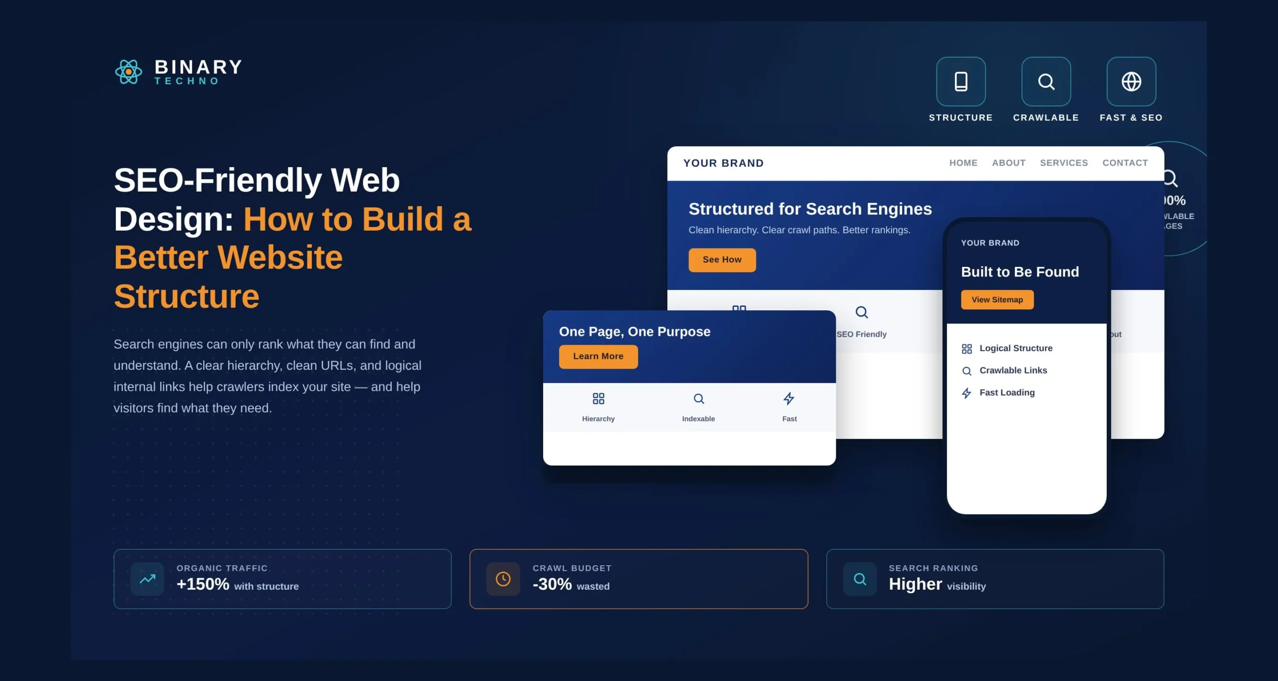
SEO-Friendly Web Design: How to Build a Better Website Structure
Objective
Learn how to design a clear, user-friendly website structure that helps search engines crawl your pages easily and provides visitors with an intuitive navigation experience to boost rankings and conversions.
A good website should be easy to use and easy for search engines to understand. The way you arrange your pages, menus, links, and content can affect how people move around your site and how search engines find your pages.
SEO-friendly web design helps you create a website with a clear structure from the start. Simple navigation, clean URLs, mobile-friendly pages, fast loading speed, and proper internal links can make your website easier to use and crawl.
In this blog, we will explain how to create a better website structure for SEO. You will learn simple ways to organize your pages, improve navigation, connect related content, and make your website more search-friendly.
Key Takeaways
- A clear website structure helps visitors and search engines find important pages easily.
- Simple navigation, URLs, and internal links can improve website usability and SEO.
- Mobile-friendly design and fast loading speed are important for a better user experience.
- Proper page hierarchy helps search engines understand the relationship between website pages.
- Good SEO and web design can support better traffic, engagement, leads, and business growth.
Did You Know?
A study by Ahrefs found that 96.55% of all web pages receive zero organic search traffic from Google. A primary driver is poor site architecture and orphan pages that crawlers cannot reach.
Table of Contents
What Is SEO-Friendly Web Design?
SEO-friendly web design is the practice of designing, building, and structuring a website so that search engines can easily crawl, index, and understand its content, while simultaneously providing a smooth, intuitive experience for real visitors. It merges aesthetic visual elements with technical foundations.
When search engines like Google evaluate a site, they send out automated software called crawlers (or bots). These crawlers scan your site’s codebase, parse the content, follow internal links, and assess how quickly and reliably each page loads. If your site features clean code, responsive layouts, fast page speeds, and a clear architectural hierarchy, crawlers can index your pages efficiently.
At the same time, human visitors benefit from an intuitive interface. A site designed with user needs in mind ensures that information is easy to find, text is readable across all devices, and interactive elements respond instantly. When design and search optimization work together, your website attracts organic traffic and keeps visitors engaged.
Why Website Structure Matters for SEO
Website structure refers to how the pages on your site are organized, categorized, and linked together. Think of it as the architectural blueprint of a physical building. Without a solid foundation and logical floor plan, visitors get lost, and structural problems arise over time.
1. Enhanced Crawlability and Indexability
Search engines discover new content by following links from known pages to new ones. If your website has a chaotic layout with isolated pages-often called “orphan pages”-crawlers may miss critical content entirely. A well-organized structure creates direct, logical pathways for crawlers to discover every important page on your domain.
2. Strategic Distribution of Page Authority
Page Authority (or link equity) flows through your website via internal links. When your homepage receives external backlinks, that value diffuses down to secondary and tertiary pages through a well-structured linking strategy. A systematic structure ensures that your high-value conversion pages receive sufficient link equity to rank well in search results.
3. Prevention of Keyword Cannibalization
Without a clear framework, site owners often create overlapping pages that target identical topics or terms. This causes pages on the same domain to compete against each other in search engine results pages (SERPs). A structured layout assigns specific topics and intent to distinct sections, ensuring every page serves a unique purpose.
4. Better User Engagement and Dwell Time
A logical structure helps users find the information they need within a few clicks. When users navigate effortlessly, bounce rates drop, pageviews per session rise, and overall dwell time increases. These user engagement metrics signal to search engines that your site provides high-value content.
Want to Make Your Website Faster, Simpler, and More Search-Friendly?
Improve your website’s speed, usability, and search visibility with expert web design and optimization solutions tailored to your business goals.
How to Build an SEO-Friendly Website Structure
Creating a search-ready framework requires careful planning before writing code or publishing content. Follow these steps to build an optimal hierarchy for both users and search bots.
1. Adopt a Logical Pyramid Hierarchy

The most effective way to organize a site is the pyramid structure:
- Homepage: Located at the top of the pyramid.
- Primary Categories (Parent Pages): 3 to 5 core categories branching directly from the homepage.
- Subcategories (Child Pages): Specific topics nested neatly under each main category.
- Individual Posts/Products: Individual articles, product pages, or detailed documentation linked beneath subcategories.
2. Implement the Flat Site Model (Three-Click Rule)
Avoid deep hierarchies where users or bots must click four or five times to reach a page from the homepage. Strive for a flat architecture where any page on your site is accessible within three clicks or fewer from the homepage. This keeps content reachable and preserves internal link strength.
3. Build Intuitive Header and Footer Navigation
Your primary navigation bar should showcase your most important parent categories without cluttering the screen.
- Keep drop-down menus streamlined: Avoid massive multi-tiered mega-menus that overwhelm users.
- Use HTML navigation elements: Ensure menus are built with clean HTML/CSS rather than complex JavaScript that crawlers might struggle to execute.
- Utilize the footer: Include links to essential utility pages (Contact, Terms, Privacy Policy), top category hubs, and key service offerings in your footer.
4. Use Clear Breadcrumb Navigation
Breadcrumbs are text trails typically located near the top of a page that show users their current location relative to the site’s hierarchy (e.g., Home > Blog > SEO > Article Name).
Breadcrumbs help users backtrack easily without using the browser’s back button. They also provide search engines with contextual clues about page relationships and can appear directly in search engine snippet listings.
5. Establish Clean, Readable URL Structures
URLs should be easy for humans to read and predictive of page content.
Good: [example.com/services/web-design](https://example.com/services/web-design)
Bad: [example.com/index.php?page_id=4821&session=xyz](https://example.com/index.php?page_id=4821&session=xyz)
Keep URLs short, lower-case, separated by hyphens (not underscores), and inclusive of the target topic or category folder.
6. Master Strategic Internal Linking
Internal links connect pages within the same website. Use descriptive, natural anchor text rather than generic phrasing like “click here” or “read more.” Connecting related articles helps build topical clusters, demonstrating to search engines that your domain possesses depth on specific subjects.
7. Maintain XML and HTML Sitemap Technical Foundations
- XML Sitemap: A machine-readable file listing all indexable URLs on your site. Submit this file to Google Search Console and Bing Webmaster Tools to ensure fast discovery.
- HTML Sitemap: A human-oriented directory page listing key categories and pages, helping users and crawlers navigate large sites.
How UX and SEO Work Together in Web Design
User Experience (UX) and Search Engine Optimization were once treated as separate disciplines. Today, they are deeply intertwined. Search engines analyze user signals to verify whether a ranked page delivers a satisfying experience.
Mobile-First Responsiveness
Google predominantly uses the mobile version of a site’s content for indexing and ranking. An SEO-friendly website design must adapt seamlessly to smartphones, tablets, and desktops. Following a mobile responsive website design approach ensures your site provides a consistent experience across different screen sizes. Design with responsive layouts, touch-friendly navigation buttons, readable font sizes, and scalable images.
Core Web Vitals and Page Speed Optimization
Core Web Vitals are specific metrics Google uses to measure real-world user experience regarding loading performance, interactivity, and visual stability:
Metric | What It Measures | Target Score |
LCP (Largest Contentful Paint) | Loading speed for main content | Under 2.5 seconds |
INP (Interaction to Next Paint) | Responsiveness to user interactions | Under 200 milliseconds |
CLS (Cumulative Layout Shift) | Visual stability during page load | Under 0.1 |
To optimize these metrics:
- Compress and convert images to modern formats like WebP or AVIF.
- Minify CSS, JavaScript, and HTML files.
- Implement browser caching and leverage Content Delivery Networks (CDNs).
- Reduce render-blocking resources.
Accessibility Standards
Designing an accessible website ensures that people with disabilities-including those using screen readers-can interact with your site. Proper use of semantic HTML tags (<header>, <nav>, <main>, <article>, <footer>), high color contrast, keyboard navigation support, and descriptive alt tags for images benefit human visitors while helping search engine crawlers interpret image content correctly.
How SEO-Friendly Web Design Can Improve Business Results
Investing in proper site structure and optimization is not merely an exercise in technical compliance-it directly influences key performance metrics and business profitability.
Higher Organic Rankings and Visibility
When your site is easy to crawl and structured logically, search engines reward you with higher rankings for relevant queries. Higher visibility leads to consistent, organic traffic without relying solely on paid ad campaigns.
Increased Conversion Rates
An SEO optimized website guides users through a logical funnel. Clear calls-to-action (CTAs), intuitive menus, and fast loading times minimize friction during the buyer journey, converting casual visitors into leads or customers.
Cost Efficiency and Long-Term Value
Building a proper framework from day one reduces the need for frequent, expensive site redesigns. While paid advertising stops generating leads the moment your budget ends, a structured, search-optimized platform yields long-term organic results for years.
Give Your Website a Stronger SEO Foundation
From site structure to navigation, Binary Techno can help build a website designed for better visibility and usability.
The Key to a Better SEO-Friendly Website
Building an SEO-friendly website requires balancing user needs with technical search engine guidelines. By establishing a clear pyramid hierarchy, organizing content with intuitive menus and clean URLs, maintaining effective internal linking paths, and optimizing for mobile speed and accessibility, you can create a scalable platform built for long-term success. Since mobile usability also plays an important role in search performance, understanding why mobile-friendly websites matter for SEO can help you make more informed design decisions.
A strong website structure should also evolve with your business. As you add new products, services, or content, maintaining a clear and consistent structure helps both users and search engines navigate your website more effectively. With the right approach to website design and development, businesses can create a stronger foundation for organic visibility and growth — something Binary Techno keeps in mind when building websites for modern businesses.
Frequently Asked Questions
What is SEO-friendly web design?
SEO-friendly web design means creating a website that is easy for visitors to use and search engines to understand. It includes clear navigation, simple URLs, mobile-friendly pages, fast loading speed, proper headings, internal links, and a well-organized structure that makes important information easy to find.
Why is website structure important for SEO?
Website structure helps search engines understand how your pages are connected. A clear structure also makes it easier for visitors to find information. Proper categories, navigation, internal links, and page hierarchy can help search engines discover important pages and provide visitors with a better browsing experience.
How can I make my website structure better for SEO?
Start by organizing your pages into clear categories and creating simple navigation. Use descriptive URLs, connect related pages with internal links, add breadcrumbs where useful, and keep important pages easy to reach. Also, make sure your website works well on mobile devices and loads quickly.
Does website navigation affect SEO?
Responsive design can support SEO by creating a better mobile experience. It helps search engines access and understand one website across different devices. A responsive layout can also support better page performance and usability. These factors can help create a stronger foundation for your overall SEO strategy.
Why are internal links important for website structure?
Start by using a flexible layout that adjusts to different screens. Make text readable, optimize images, simplify navigation, and create touch-friendly buttons. Avoid horizontal scrolling and oversized elements. You should also test forms, menus, pages, and other important features across different devices before launching.
Should website design be mobile-friendly for SEO?
Yes, a website should work properly across smartphones, tablets, and desktops. Mobile-friendly design makes text easier to read, buttons easier to use, and pages easier to navigate. A responsive layout also provides a better experience for visitors who access your website from different screen sizes.
How does website speed affect SEO-friendly design?
Website speed affects both user experience and website performance. Slow pages can cause visitors to leave before they interact with your content. Compressing images, reducing unnecessary scripts, improving code, and using reliable hosting can help pages load faster and create a smoother browsing experience.
Can a better website structure improve business results?
Yes, a clear website structure can help visitors find information, explore services or products, and reach important conversion pages more easily. When navigation, content, performance, and calls to action work together, your website can provide a better experience and create more opportunities for inquiries, sales, or bookings.